Axis Consulting
This project aimed to refresh Axis Consulting's brand identity, modernising its visual presence while emphasising a narrative of upward growth and continuous innovation.
My Role
As part of a two-person team, I played a pivotal role in continuously iterating the logo, revamping the art direction and refining brand copy to ensure the new direction seamlessly aligned with the brand's story and core values.
Tools
Figma
Adobe Suite
Teammates
Joseph Lee
Scope
12 weeks
Fall 2024 -
Spring 2025
The Design Process
Understanding the Client
Overview
Axis Consulting is a student-led, pro bono consulting organisation dedicated to fostering personal growth and driving meaningful impact within both the student community and the businesses it supports.
The Challenge
Axis's previous logo and brand identity lacked a sense of professionalism and cohesion, relying primarily on the colour blue without a unified visual or conceptual foundation.
The Goal
In refreshing the brand, our objective was to create a visual identity that reflected Axis's core values of innovation and transformation.

The pre-existing Axis Consulting logo
A New Art Direction
Moving away from the earlier condensed typeface, I chose Apfel Grotesk as a modern sans serif to anchor the refreshed brand identity. Its unique curves and rounded edges supports Axis’s forward-thinking ethos and commitment to innovation, while still fitting comfortably within a professional consulting context. We also refreshed the original Axis blue, choosing a brighter, bolder shade to convey renewed energy, confidence, and clarity.
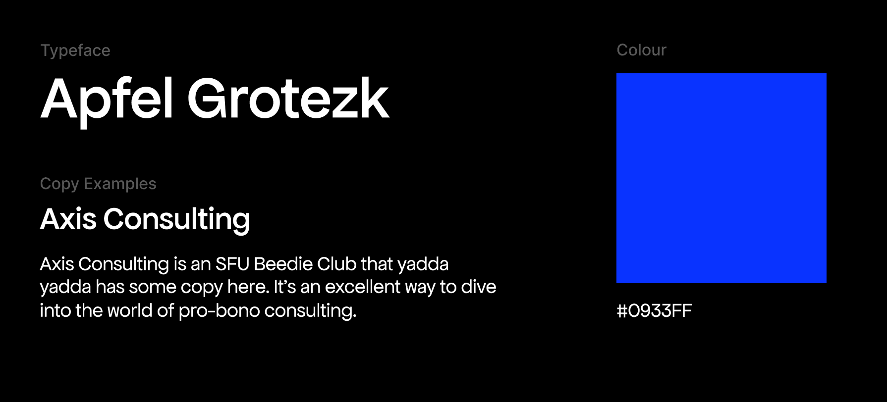
Chosen typeface and colour for the new art direction
Evolving the ‘X’
To evolve the original 'X' character within the logotype, I explored two distinct directions.
The first concept presents a symmetrical, monolithic 'X' with a strong geometric structure and sharp angles. This bold form was designed to convey confidence, professionalism, and signal Axis’ decisive, change-making spirit.
The second design explored a more fluid, dynamic approach composed of intersecting arcs and curved geometry. This iteration played on Axis’ values of innovation - suggesting adaptability and continuous growth through transformation which is not abrupt but thoughtful and evolving.

Direction One

Direction Two
Reframing
While the initial ‘X’ explorations were visually compelling, feedback from the Axis community highlighted the need for greater continuity with the existing brand. Given our longstanding presence with SFU students and clients, it became clear that recognisability was key. Rather than pursuing a drastic overhaul, we reframed and pivoted toward a strategy of incremental change - modernising the idefntity while preserving its core elements and maintaining the Axis legacy. We consulted previous brand refreshes as precedents to inform this new approach, balancing evolution with familiarity.
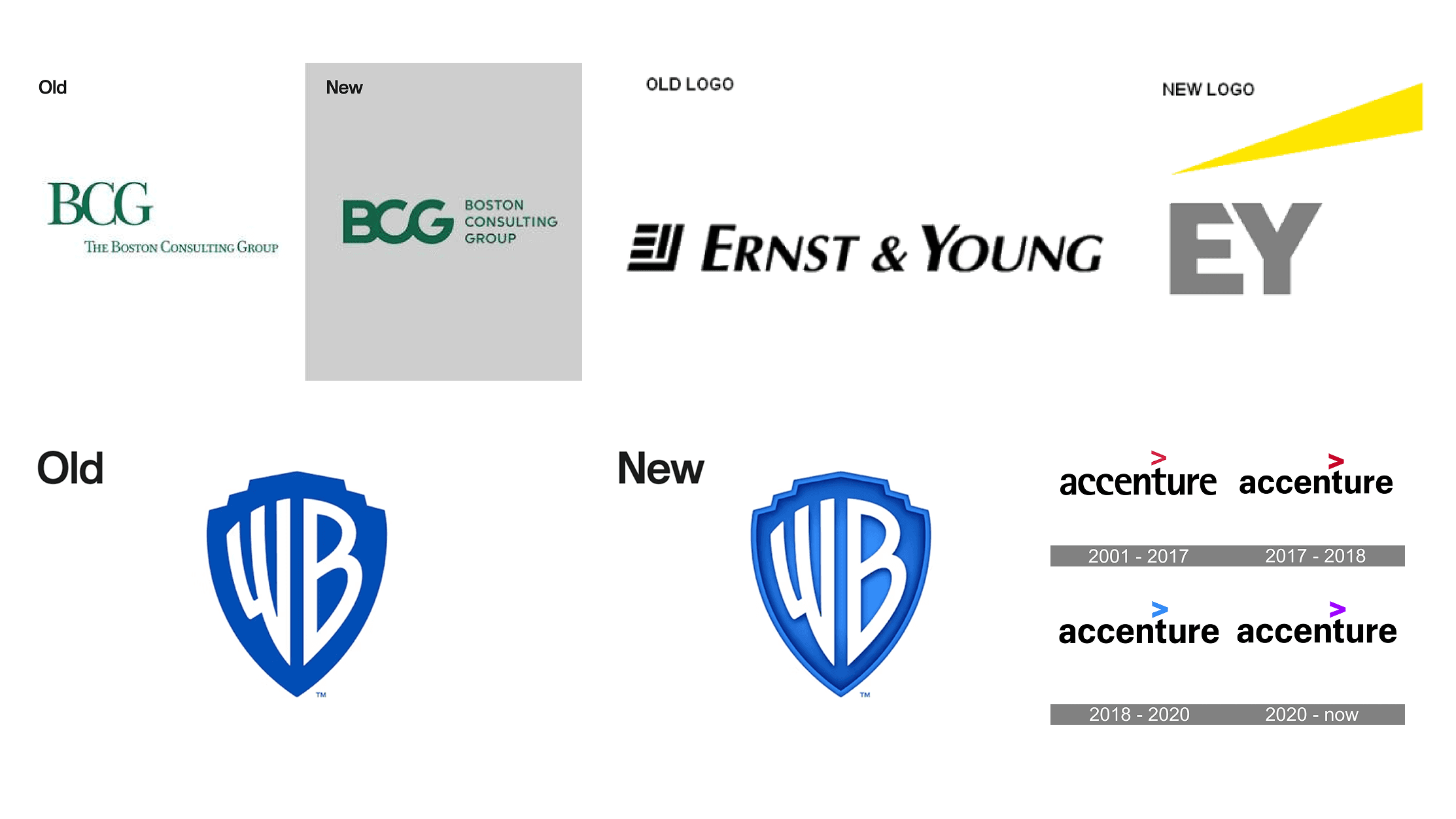
Brand refresh precedents which implemented more minor, incremental changes
Final Iterations
We decided to stay with Axis' original brand direction of a logotype to preserve its legibility and recognisability, rather than introducing a separate logomark. Instead of focusing on the 'X', we explored the potential of the 'A' in "Axis," merging the original arrows with the concept of upward movement.
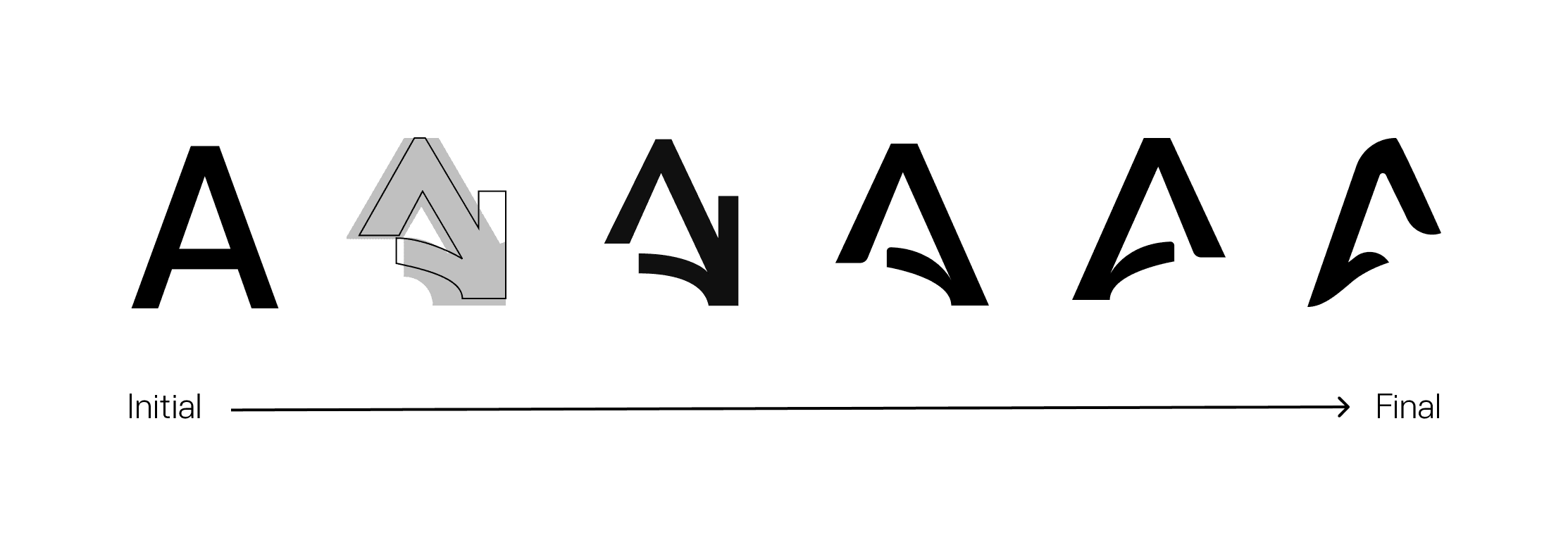
The evolution of logo iteration
Initially, iterating the shape of the 'A' letterform resulted in a downward arrow, carrying negative connotations of decline and feeling visually heavy when compared to the rest of the logotype. We then reversed the motion by flipping the 'A' and shifting its curve upward, subtly forming an ascending arrow shape. The final logo iteration refines this gesture of growth and upward movement, introducing smoother curves and sharper angles for a more distinctive and dynamic form. It creates a clean, recognisable typographic mark that feels both modern and professional, bridging the brand’s legacy with a renewed visual identity.
Impact
The brand refresh was a great success. The new logo and art direction was adapted across all social media platforms and event assets, representing Axis at its major pillar event of the year.

The final 'A' logomark

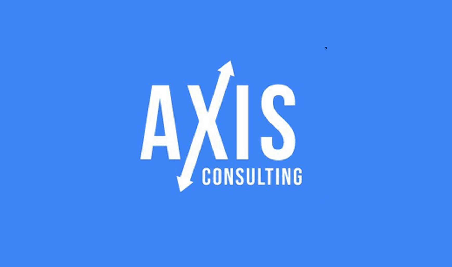
The final Axis Consulting logotype
Personal Reflection
Time, thought and identity
Creating a brand identity is a thoughtful, time-intensive process that goes far beyond just visuals. It requires a deep understanding of the client, its legacy, and how to translate that into a visual language that both honors the past and signals future direction. Through this brand refresh, I learned the importance of balancing strategic thinking with creative execution - ensuring every design decision meaningfully reflects the values and vision of the organisation.
Small shifts, big impact
What began as an ambitious design overhaul evolved into a more thoughtful refinement of Axis’s existing identity. This process taught me the value of working with what’s already there - how small, intentional changes can carry more weight and impact than sweeping redesigns, especially when rooted in continuity and purpose.