Colour Palette
SIAT Frosh
Super Mario inspired art direction and branding for a school event, including the creation of a logo, posters, merchandise, graphics and an interactive map to encourage student engagement.
Art Direction Experimentation
To begin purposeful graphic exploration while paying tribute to the chosen Super Mario theme, I proceeded to investigate the various Super Mario styles and the brand’s evolution through the years. As this was to be the art direction for a freshman orientation event, we were inclined towards forging a direction which would highlight a bright and lively game atmosphere. This led us to conduct further research into the 1980s retro design aesthetics, branching out from the standard Super Mario style and cultivate our own unique brand identity. We were hoping to integrate elements of this distinctive, consistent style to universally known Super Mario elements, creating a cohesive and appealing art direction that could be easily replicated through all of our graphic assets.
Convergence onto Art Direction
We converged on a 'Paper Mario-esque' theme, simplifying graphic elements while enabling creative experimentation within cohesive design constraints. The art direction evolved with a muted red, blue, yellow, and green palette inspired by Super Mario’s iconic colors, paired with ivory backgrounds to evoke a vintage feel. Typography featured the Super Mario 256 font alongside Powerr, Aero, and experimental retro-inspired fonts, balanced by a neutral typeface to craft a distinctive brand identity.
Visual elements, designed as replicable icons, reimagined classic Super Mario motifs with 3D and drop-shadowed paper effects. This approach added depth, texture, and layers, enhancing the Paper Mario aesthetic across the composition.
My Role
I was a visual designer on this project, creating art direction, graphic assets as well as forging a new brand identity and logo. I further handled all of the interaction and prototyping for the interactive event map.

A selection of precedents gathered when forming art direction
A selection of logo iterations the team created
Logo Design
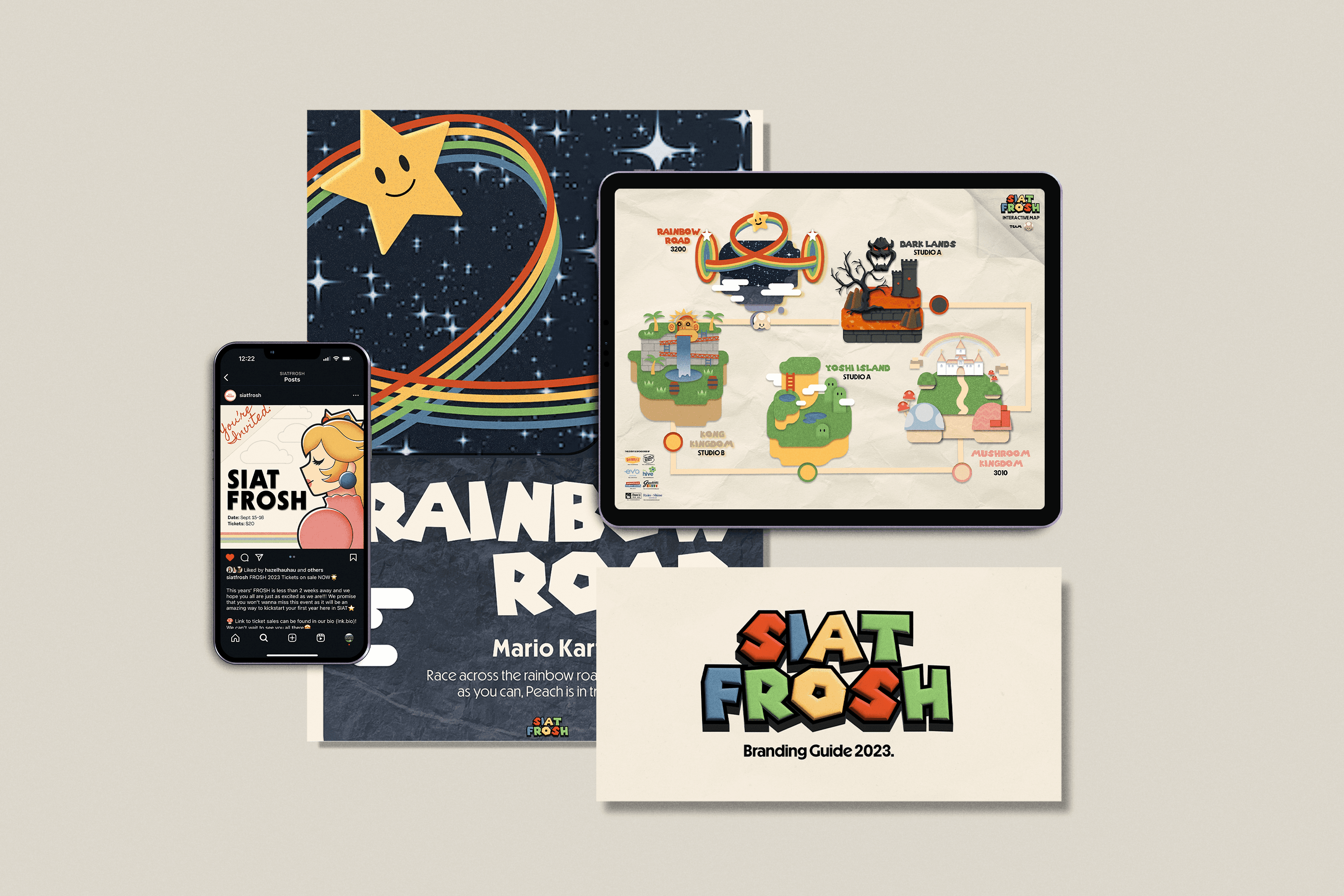
We then proceeded to construct our event logo, integrating the paper mario art direction by experimenting with simplified graphics, experimental distinctive type and shadows which evoked a three dimensional print feel. Some of the original Super Mario typefaces were still used to immediately portray the graphic theme of the event and retain the nostalgia as well as excitement associated with these easily recognisable fonts.
Graphic Assets
A range of graphic assets were then produced in accordance to the event’s needs. Posters, interactive maps, merchandise and social media graphics were constantly reiterated to reflect appealing visual elements and portray our consistent brand direction.
Personal Reflection
This project mainly helped me to remember that design is meant to be fun. It can feel perfectionistic and frustrating so often when tackling big works but this project really allowed me to lean into graphic exploration when I did not care as much about design principles and syntax. I was simply gaining the fulfillment of seeing my lively and fun creations come to life. Developing a solid foundation in design syntax and parsing through design processes which cultivate intentional, unified visual compositions is crucial for a designer. However, sometimes it is even more important to let loose, create and remember what drew me to this art form :)


